

Nextjs & Storyblok image optimization. Part 2
This is the second part of the article. The first one can be found here
Overview of Storyblok’s Image API Service
Storyblok itself has an Image API service that allows us to change images on the fly.
Using this service, we can upload a high resolution image and reuse it in multiple places as needed without performance issues.
A full description can be found on the official documentation page, but we confine ourselves to resizing and quality as more important.
Storyblok has its own automatic conversion to WebP. We can convert to WebP by adding /m/ at the end of the image URL: https://a.storyblok.com/f/39898/3310x2192/e4ec08624e/demo-image.jpeg/m/
All image conversion options must be after this /m/ path. Storyblok automatically converts images to WebP only when supported by the browser, but explicit WebP conversion requires format(webp)
For instance we want to get an image with specific width and resized proportional to width we can do it so: https://a.storyblok.com/f/39898/3310x2192/e4ec08624e/demo-image.jpeg/m/200x0 We will get an image with a width of 200 and a height calculated according to the aspect ratio.
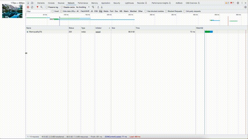
The quality filter allows controlling compression strength. Lower values mean stronger compression and smaller file sizes, but with potential quality loss. https://a.storyblok.com/f/39898/3310x2192/e4ec08624e/demo-image.jpeg/m/1080x0/filters:quality(70)
Using Storyblok Image Service with Custom Loader
Instead of default loader we can use custom loader with Storyblok image service
const loader = ({ src, width }) => `${src}/m/${width}x0/filters:quality(70)`;
Width here corresponds to device and image sizes provided from next.config.js. We saw default values for width in srcset in code snippet above
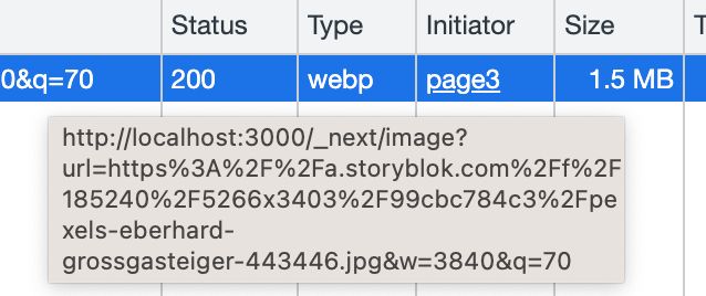
If we check the sizes of the uploaded images in both cases:
- with default loader
- and custom loader
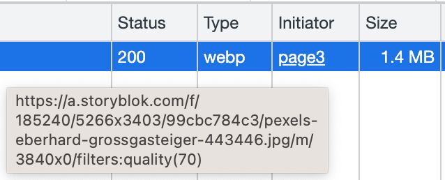
We can conclude that the Storyblok optimization has better compression – 1.4MB vs 1.5MB
When using the default loader images will be served from your <distDir>/cache/images folder, in this case, the image will be served until the cache expires. Next.js does not re-optimize an expired cached image immediately, but rather it serves the cached version while asynchronously generating a new one.
You can control the Time to Live (TTL) in seconds for cached optimized images:
module.exports = {
  images: {
    minimumCacheTTL: 60,
  },
}
If you decide to use the Storyblok image service with a custom loader – you can delete Storyblok domain from next.config.js. In this case, images will be served from Storyblok CDN and CDN is also responsible for caching.
But in most of the cases, we need a lower resolution. We can add a rule for the image size in the sizes`` attribute.
We can resize images via service but we don’t know the actual sizes of the image. To correctly render the image we need two of these: width, height, aspectRatio.
Alternative Solutions for Image Sizes
According to the official docs, the sizes of bitmaps can be found in the URL of the image.
import Image from "next/image";
export default function Page() {
  const url =
    "https://a.storyblok.com/f/spaceId/5266x3403/99cbc784c3/pexels-eberhard-grossgasteiger-443446.jpg";
  const width = +url.split("/")[5].split("x")[0];
  const height = +url.split("/")[5].split("x")[1];
  const aspectRatio = width / height;

  return (
    <div
      style={{
        position: "relative",
        width: "100%",
        aspectRatio,
      }}
    >
      <Image src={url} alt="landscape" fill objectFit="contain" />
    </div>
  );
}
But I’ve noticed that sometimes the image doesn’t have dimensions in the url. So we can’t rely on that.
What could be another solution?
We can load our images through custom plugin to store image properties on the block level
At the plugins page we can add new field type and define our plugin:
const ImageSelector = {
  mixins: [window.storyblok.plugin],
  template: `<div>
     <sb-asset-selector :uid="uid" field="image"></sb-asset-selector>
     <img :src="model.image">
     <div>aspect ratio: {{ model.ratio}}</div>
     <div>width: {{ model.max_width}}</div>
     <div>height: {{ model.max_height}}</div>
  </div>`,
  methods: {
    initWith() {
      return {
        plugin: 'image-selector',
        image: '',
        ratio: 0,
        max_width: 0,
        max_height: 0,
      };
    },
  },
  watch: {
    'model.image': function (value) {
      if (
        typeof tinymce !== 'undefined' &&
        this.model.image &&
        this.model.image.length > 0
      ) {
        tinymce.activeEditor.insertContent(
          '<img alt="Image" height="42" width="42" src="' + value + '"/>'
        );

        this.model.image = '';
      }

      function setDimensions({ ratio, height, width }) {
        this.model.ratio = ratio;
        this.model.max_width = width;
        this.model.max_height = height;
      }

      const bound = setDimensions.bind(this);
      const img = new Image();
      let ratio = this.model.ratio;

      img.onload = function () {
        ratio = this.width / this.height;
        bound({ ratio, height: this.height, width: this.width });
      };

      img.src = this.model.image;
    },
    model: {
      handler: function (value) {
        this.$emit('changed-model', value);
      },
      deep: true,
    },
  },
};
Then you need to publish it to make it accessible for your spaces. Then you can use it as field on block level
Images will be selected from your assets.
One important thing: when using the plugin, you will lose the alt field for the image. A possible workaround is to get the alt from src or add a new field to input alt
Select the field type plugin and in the custom type find the name of your plugin.
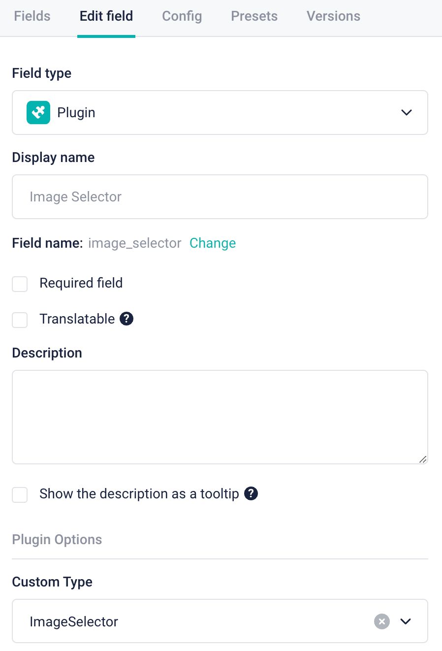
After uploading an image through this field you will have exact dimensions of the image

Sample response where the fields: max_width, max_height, ratio and image will be under the image_selector field:
{
  _uid: "3962b80e-0e03-4339-888a-a78f10271be7",
  component: "embedded-image",
  image_selector: {
    _uid: "37183cfe-cf20-4c54-aa76-bc017fdaacae",
    image:
      "https://a.storyblok.com/f/spaceId/5266x3403/99cbc784c3/pexels-eberhard-grossgasteiger-443446.jpg",
    ratio: 1.5474581251836614,
    plugin: "image-selector",
    max_width: 5266,
    max_height: 3403,
  },
  _editable:
    '\u003c!--#storyblok#{"name": "embedded-image", "space": "185240", "uid": "3962b80e-0e03-4339-888a-a78f10271be7", "id": "287960730"}--\u003e',
}
Then you can use width 100% with aspect ratio for the container. This will fill all available width and height will be according to aspect ratio and width
 Responsive layout
Moving from a smaller viewport to a larger one will require loading higher quality images.
import Image from "next/image";
export default function Page() {
  const loader = ({ src, width }: { src: string; width: number }) =>
    `${src}/m/${width}x0/filters:quality(70)`;
  return (
    <div
      style={{
        width: "100%",
        height: "100%",
        maxWidth: "1200px",
        margin: "0 auto",
        padding: "20px",
      }}
    >
      <div
        style={{
          position: "relative",
          width: "100%",
          aspectRatio: 1.5474581251836614,
        }}
      >
        <Image
          src="https://a.storyblok.com/f/spaceId/5266x3403/99cbc784c3/pexels-eberhard-grossgasteiger-443446.jpg"
          alt="landscape"
          fill
          objectFit="contain"
          loader={loader}
          sizes="(max-width: 640px) 100vw, 1200px"
        />
      </div>
    </div>
  );
}
It should be noted that Storyblok has an image editor where you can edit your assets: crop, rotate, etc.
Recap of the Discussed Image Optimization Approach
In this article, we discussed one way to optimize images in Nextjs and Storyblok apps. This approach is suitable when we need to effectively reserve space for images. In this case, we don’t worry about image sizes and process them in the application depending on its actual size.
For example, small images can be arranged in a row one after another, large ones can be full width. Also when using an image slot with a fill attribute, we won’t see any CLS.
We’re a specialist Storyblok agency helping teams transition to modern content platforms with clean architecture, scalability, and editorial control. If you’re planning a replatform or building from scratch, reach out — or book an intro call with our team.


)