
Key Takeaways
- The problem: You can’t extend Storyblok’s native field types. When a design change touches a native field, you have to update every schema that uses it.
- The pattern: Wrap each native field in a custom block, such as
headline,imageorbackgroundImage. A change made once in that block reaches every component that embeds it. - The architecture: Content flows through three layers: a content section, an adapter and a UI component. The adapter maps CMS data to props, so the UI never depends on Storyblok’s data shape.
- The result in production: On a Next.js and Storyblok build with 77 section types, several late requests each landed in one shared block rather than dozens of schemas. They covered per-section heading levels, image borders, color overlays on background media and GA4 click tracking on CTAs.
- Bonus for AI coding agents: Every block has the same shape (a generated TypeScript type, an adapter and a component), so agents can make site-wide changes reliably.
- When to skip it: The pattern pays off when blocks repeat across many pages and editors build pages on their own. On a small brochure site it’s unnecessary overhead.
Every long-lived Storyblok website gets the same request eventually: “Can we make this work everywhere?” It might be a new heading level on every section, or a color overlay on every background image. It arrives months in, long after the content model is set. That’s the moment your earlier decisions either pay off or come due.
On most projects, it comes due: the capability lives in dozens of schemas, each edited and kept in sync by hand. On our Storyblok build, the same request was usually one field and one line. It’s the payoff of a schema pattern that looks like over-engineering while you’re building it.
The Storyblok schema pattern: wrap native fields in your own blocks
A headless CMS gives you a fixed set of field types: text, rich text, an asset, a couple of link types. The obvious path is to bind them straight to your components. It works, and it quietly locks you out.
Native types are closed: you can configure them, but you can’t extend them. With a code-first CMS like Payload, you can define and extend the field configuration in your code. With Storyblok, the native field belongs to the platform, so the reusable layer you control is the block around it. When a design decision outgrows a field, you’re back to editing every schema that touched it.
So we’ve wrapped the native types in our own. Early on, that reads like pure overhead.
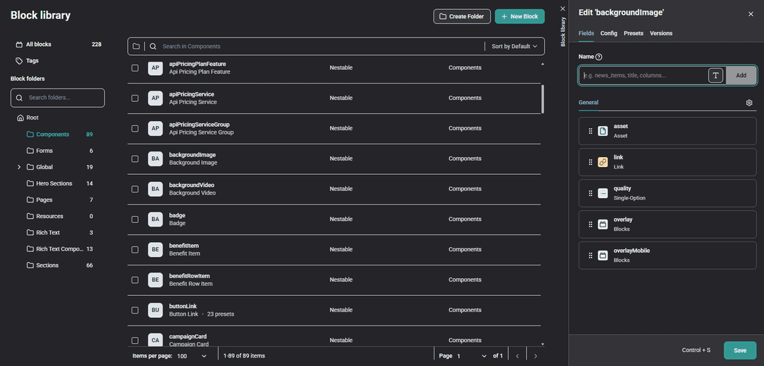 Storyblok's Block Library with our own components (headline, image, backgroundImage, imageOverlay, and others). The backgroundImage block wraps the native asset and adds its own fields (quality, overlay).
Start with the simplest case, a heading. Storyblok gives you a text field, and we put a headline block in front of it, backed by a component whose only job is to pick the tag:
export function Headline({ as: Component = "h2", children, className, ...props }: HeadlineProps) {
  if (!children) return null;
  return <Component className={className} {...props}>{children}</Component>;
}
The component never touches the CMS. Nothing in our UI does. Content moves through three layers, each with one job: a content section reads the raw block, an adapter turns CMS shape into props (unwrapping Storyblok’s arrays, mapping fields, and carrying live-preview bindings), and the UI component renders without knowing where its props came from.
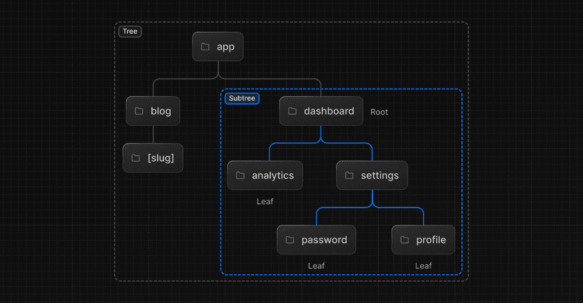
 Content moves one direction through the three layers: Storyblok CMS, content section, adapter, UI component.
Keeping the CMS, data mapping and presentation separate is a core principle of headless CMS architecture, and the wrapper is what makes it work at the field level. When requirements shift, you change one place instead of forty.
Same reason we don’t use one image block for everything. image is a content image placed within the page flow, while backgroundImage is used behind a section, similar to a hero or section background image in Storyblok. Because these assets serve different purposes, they have different focal point and quality requirements. The two stay separate on purpose.
On a five-page site, this is overhead you’d skip. With 77 section types, that difference becomes significant: a one-line change in a shared block can replace a much larger schema migration.
How the Storyblok schema pattern pays off
We got that request three times, always late in the build, and each one turned out to be small.
The heading request came first. The Headline component already accepted an as prop, so when editors needed to set the level per section, the component didn’t change. We added one field to the block and one line to the adapter:
...(item.level && item.level !== "h1" && { as: item.level }),
Every section with a headline picked up the control at once. The one carve-out: h1 belongs to the page’s hero, so the block doesn’t offer it.
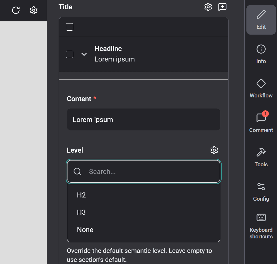 The headline block's Level dropdown (H2 / H3 / None): the per-section override every headline now gets.
The image block tells the same story from the other side. A native asset hands an editor a file, alt text, and a focal point, and leaves the rest to you at every call site: the CDN URL, responsive sizes, format negotiation, and the focal-point math. Our image block carries all of that once. Add something there and it lands everywhere image is used. An optional border with configurable opacity went in exactly that way, without touching a single schema.
The clearest case came last, with background media. Design wanted color overlays, with opacity and blend modes, on both background images and background videos. On raw assets that means editing every background-media schema and keeping them in sync by hand. But the overlay was already its own block, embedded by both:
export interface StoryblokImageOverlay {
  color?: "black" | "cold-dark";
  opacity: string;
  blendMode?: "" | "multiply" | "overlay" | "softLight" | "screen";
  /* … */
}

interface StoryblokBackgroundImage { overlay?: StoryblokImageOverlay[]; /* … */ }
interface StoryblokBackgroundVideo { overlay?: StoryblokImageOverlay[]; /* … */ }
Extend the overlay once, and image and video both pick it up, everywhere they appear. Two schemas, not forty.
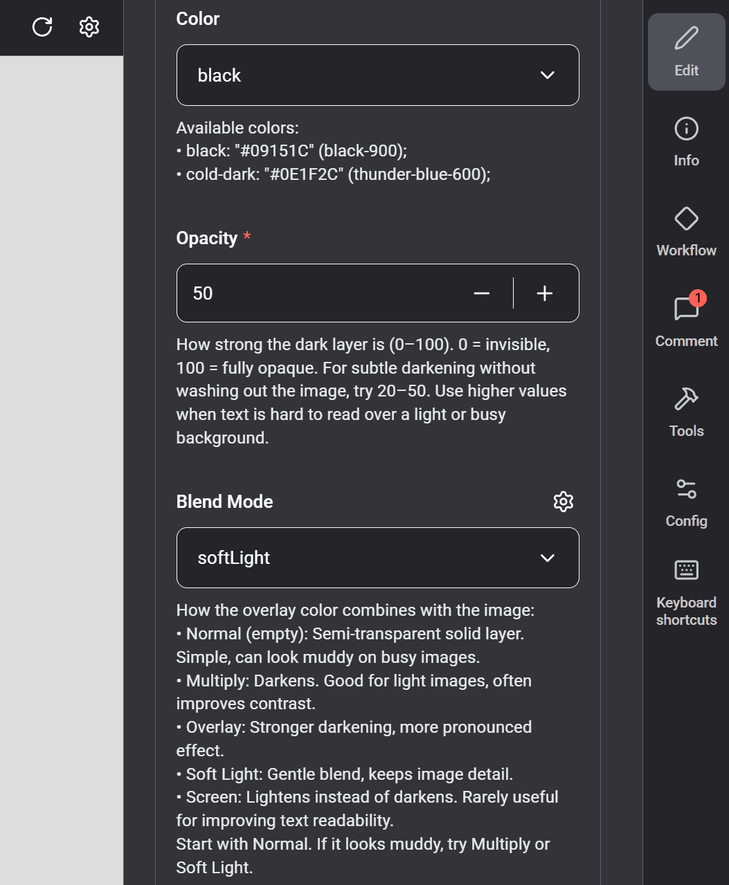 The imageOverlay fields on a background block (color, opacity, blend mode) as an editor sees them.
The requests didn’t stop at launch. The next one came from marketing: click tracking on every CTA, firing a GA4 event with an ID editors assign in the CMS. Every button on the site already rendered through our buttonLink block and one shared Link component, so the feature came down to a field on the block, a data attribute on the link, a small delegated click listener, and one line in the adapter:
trackingId: item.trackingId ? String(item.trackingId) : undefined,
The pull request touched eight files, and half of the diff was regenerated types. It wasn’t even shipped by the person who designed the blocks. A seam we built with design changes in mind turned out to serve an analytics request just as well.
None of this was planned ahead, and that’s the point. The architecture made no guess about which request would come next. It only made sure each one landed in a single place.
The same structure works for coding agents
There’s a second payoff, and it showed up on its own. The same uniformity that makes a change cheap for us makes the codebase legible to an AI agent.
Every block has the same shape: a generated TypeScript type, an adapter, a component. The types come straight from the CMS schema, regenerated whenever it changes. So when we point a coding agent at a new option to thread through the project, it isn’t guessing. The type already says which blocks carry a headline. The adapter pattern shows where the mapping belongs, and the compiler catches anything you miss. “Add this control everywhere it applies” turns into a task an agent can actually finish.
It reaches into the CMS, too. Storyblok’s MCP tooling can give coding agents direct access to CMS context, helping keep the block design and rendering code in sync.
An agent is only as reliable as the structure it works in. Ours was already built for that.
When not to do this
There’s a cost here, and it isn’t always worth paying. Every wrapper is a file to write, a type to regenerate, and an adapter to maintain. On a landing page with five sections, that overhead buys you very little. You’ll edit the markup directly faster than you’ll design a reusable Payload block for it. Use the native fields and move on.
The trade-off changes when content outlives a single layout. The same block appears across dozens of pages, editors build pages without developer support, and the project runs long enough that site-wide changes become inevitable. This project hit all three. A simple brochure website usually hits none.
The payoff also depends on discipline. One wrapper that reaches beyond its layer, or one adapter that hides special-case logic, and the abstraction starts working against you. Keep the boundaries clear and a reusable CMS architecture remains easy to maintain.
Most of the value comes from judgment: knowing which page builder components and content blocks will benefit from a wrapper before you build them.
Build the seam before you need it
The pattern is easy to dismiss as unnecessary overhead. A wrapper around a text field or a separate block for an image can feel excessive when the native field already works.
The benefit appears later. The first time a change needs to reach every page at once, you update a single component instead of chasing the same markup across the site. On long-running Next.js and Storyblok projects, that moment arrives sooner than most teams expect.
That is why reusable blocks, adapters, and clear component boundaries matter. They create a seam in the architecture that lets teams evolve content, design, and functionality without rebuilding every page individually.
We tested this approach in production while building Xweather with Storyblok and Next.js. The platform included 77 section types, hundreds of pages, and a marketing team managing content independently. Because the building blocks were modeled consistently from the start, large-scale changes stayed predictable and inexpensive.
Content modeling is one of the easiest parts of a Storyblok implementation to underestimate and one of the hardest to fix later. The decisions made early determine how easily a site can grow, adapt, and support new editorial requirements years down the line.
Migrate to Storyblok
If you’re planning a Storyblok project or rethinking an existing content model, getting expert input before the architecture is locked in can save significant time and cost later. If you’d like another set of eyes on yours from a Storyblok dev team, let’s talk.